
Cosmetic Product Photography Prompt: Blush Palette Swatch
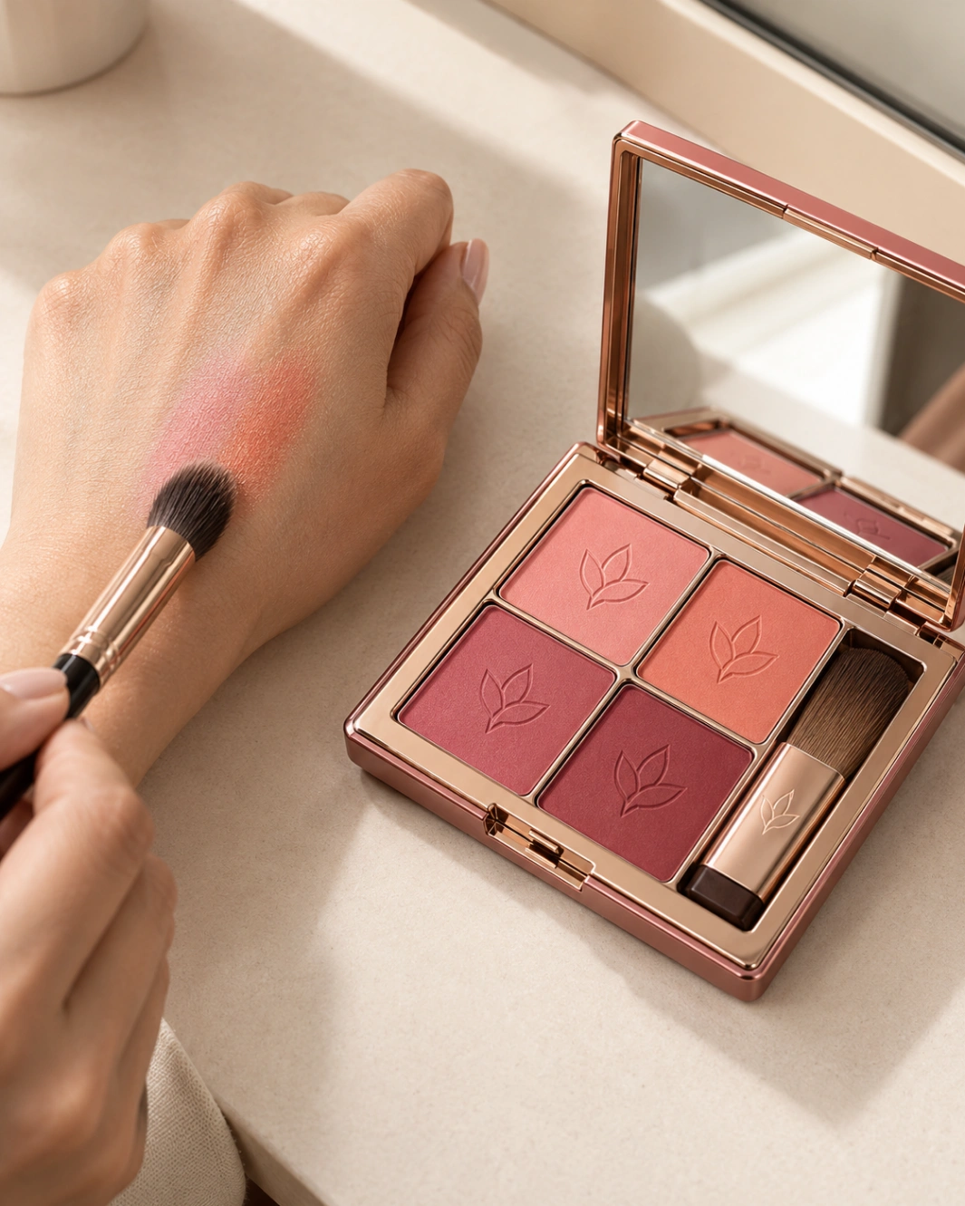
Create one photorealistic, premium beauty-editorial hero image featuring the exact LUMORA Radiant Blush Palette shown in the uploaded multi-view reference. Capture a professional makeup artist comparing two neighboring shades on the back of her hand while the open palette rests beside it. **1. VISUAL IDEA** Treat the scene as an artist's color study captured in the middle of a real makeup session. The makeup artist is blending a light petal-pink blush with its neighboring peach shade on the back of her own hand. The four-shade LUMORA palette rests open nearby, making the source colors visible. The hand functions as a practical swatch surface, while the compact supplies the precise color reference. The visual tension comes from the contrast between the carefully designed rose-gold package, the crisp square powder pans and the soft, organic gradient formed by the two blended colors. The result should feel like a genuine backstage beauty photograph, not an instructional graphic. **2. PRODUCT PRESERVATION — ABSOLUTE** Use the uploaded product reference as the sole authority for the compact's identity. Preserve the wide rectangular shape, softly rounded corners, muted dusty-rose outer casing, rose-gold/copper perimeter trim, hinge, front clasp, integrated mirror, four square powder pans arranged in their original two-by-two grid, built-in brush compartment, original brush and botanical leaf emblems pressed into each shade. Preserve the exact LUMORA wordmark, gold botanical artwork on the cover, original shade arrangement and visible typography. The four shades must remain distinct: light petal pink, peach-coral, rose and deep berry. Do not exchange their positions, merge the pans, change the powder colors, redesign the casing or invent extra compartments, pans or accessories. **3. PRODUCT ORIENTATION** Place the open compact flat on its broad lower casing, rotated approximately 20 degrees relative to the counter edge. Raise the lid to approximately 110 degrees so the mirror, four pans and brush compartment remain visible from the camera. Keep the hinge and lid mechanically credible. Orient the pan grid diagonally in the image, with the PETAL and PEACH pans nearest the artist's working hand. Place the artist's hand beside the compact, not above it. The back of the hand should face the camera, with a naturally relaxed wrist and fingers. The hand, palette and working brush must all have clear physical support. **4. ENVIRONMENT AND SPATIAL RELATIONSHIPS** Use a warm ivory makeup counter with a fine, matte surface. The open palette occupies the right half of the composition. The artist's hand enters from the left, leaving visible negative space between the hand and compact so the two blended swatches can be inspected separately. Show two adjacent swatches on the back of the hand: one light petal pink and one peach-coral, with a small blended transition where the colors meet. Keep both colors visibly distinguishable. The swatches should be thin, soft and cosmetic-like, with fine powder texture and naturally diffused edges rather than opaque paint stripes. The original four powder pans remain clean and recognizable. Do not spill loose powder across the counter or imply that the compact itself has been damaged. No extra cosmetic products, scattered flowers, decorative stones, marble pedestal or artificial powder clouds. **5. CAMERA AND COMPOSITION** Use a full-frame camera with a 65 mm lens, positioned approximately 40 degrees above the counter. Compose a tight three-quarter editorial still life that keeps both the hand and open compact in the same focal region. Make the palette large enough that the four shades, embossed leaf emblems and built-in brush are recognizable. The swatches should be large enough to communicate the blending action without becoming the dominant subject. Keep the compact's casing and gold trim visible along its outer edges. Use moderate depth of field, avoiding heavy background blur that makes the hand and product feel disconnected. **6. SUPPORTING ELEMENTS AND HUMAN PRESENCE** Include one makeup artist's hand and one small, clean blending brush held naturally in the other hand if part of the grip can be shown without crowding the composition. The brush should be picking up or finishing the blend of the petal-pink and peach shades. The visible hand must have anatomically correct fingers and realistic skin texture. The compact's built-in brush stays in its original compartment. Do not confuse it with the separate working brush. No additional people are required. **7. PHYSICALLY PLAUSIBLE LIGHTING** Use a large diffused daylight source approximately 80 × 100 cm, positioned above and camera-left at roughly 45 degrees, about 80 cm from the scene. Its broad illumination should create soft shadows beneath the hand, compact and brush while showing the real texture of the pressed powder. Place a white bounce card at camera-right to retain modest detail in the shadowed side of the rose-gold casing and the artist's fingers. Do not eliminate the contact shadows under the hand or compact. The mirror should reflect a plausible section of the bright neutral room and the actual surrounding tabletop. The metallic trim should reflect the diffused source as controlled highlights, not glow independently. Keep the powder matte, the casing subtly reflective and the skin naturally textured. Use neutral daylight around 5200 K so the pink and peach remain accurate. **8. VISUAL HIERARCHY** First, the two blended swatches and the open LUMORA palette together. Second, the original four shades and their embossed botanical emblems. Third, the working brush and the compact's metallic detailing. The story must remain understandable at thumbnail size: the artist is comparing colors from this particular palette. **9. REALISM AND FINISH** Render believable cosmetic swatches, realistic pores and hand anatomy, powder microtexture, accurate four-pan geometry, precise gold trim, credible mirror reflections and natural contact shadows. Preserve the original brand spelling and package details. Avoid paint-like swatches, extra fingers, merged pans, altered colors, floating brushes, fake glow, powder explosions, excessive skin retouching or artificial sparkle. Deliver one polished commercial hero image with no added text beyond the original product branding. Aspect ratio: 4:5
Why use this prompt?
A copy-paste cosmetic product photography prompt for a blush palette swatch shot — a makeup artist blends petal pink and peach on the back of her hand with the open palette beside it, shot like a real backstage beauty editorial.
- ✨ Exact Product Control: Keep all four LUMORA shades, the rose-gold casing, mirror and embossed leaf pans exactly as your reference.
- ✨ A Moment, Not a Mockup: The hand swatch shows the colours honestly — petal pink and peach blended live, no paint-stripe fakes.
- ✨ Ready for Social: Tight 4:5 editorial framing that reads at thumbnail size, made for beauty feeds and launch posts.